
Artfully Bourbon / November 18, 2026The Kentucky bourbon maker is taking its signature red wax beyond the bottle, using wheat, oak and native plants to create a new visual identity rooted in its distillery.
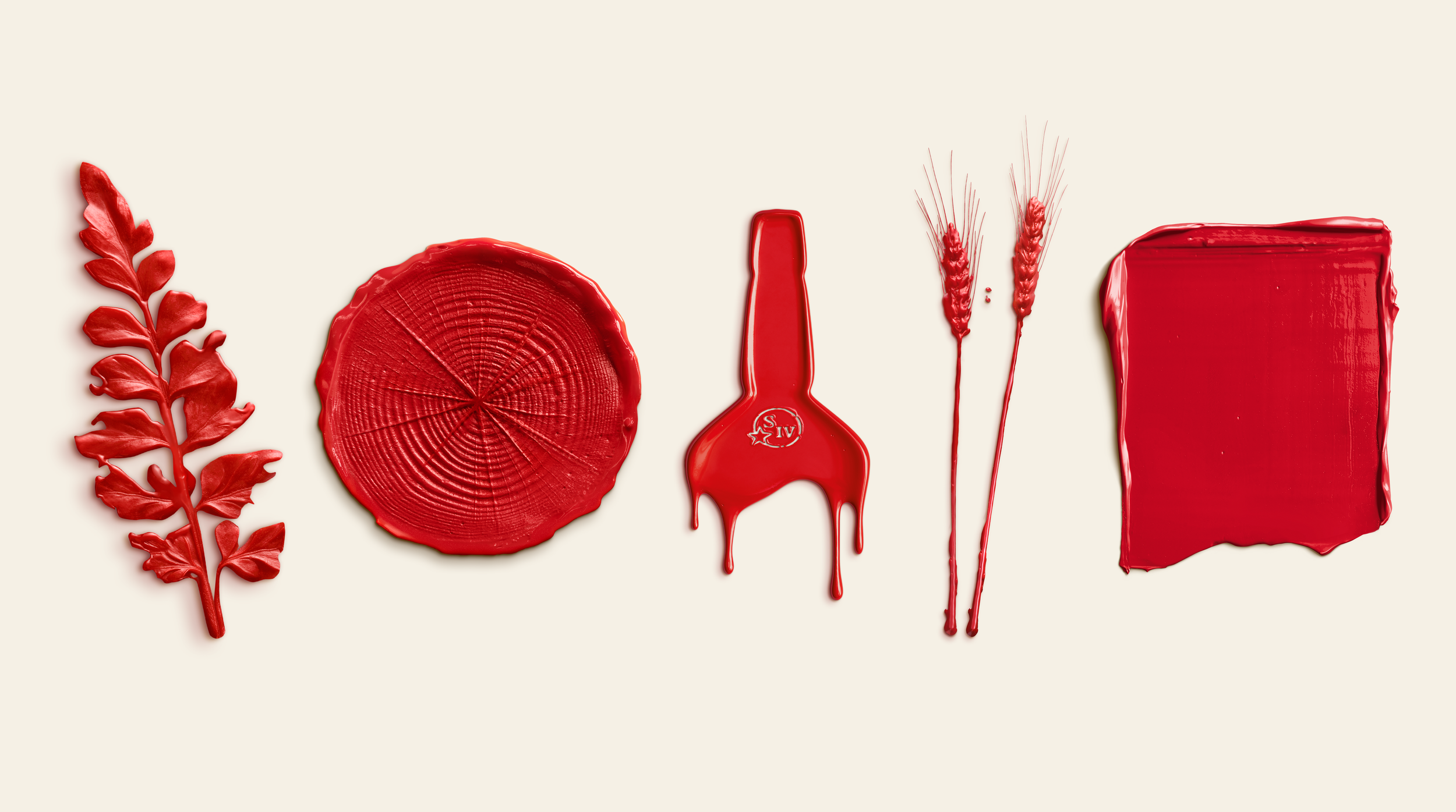
Photo Credit: Maker's MarkFew things in bourbon are as recognizable as the red wax dripping down the neck of a Maker's Mark bottle. It's been part of the brand since the beginning, and you can spot it across a liquor store without reading a single label. Now, Maker's Mark is taking that familiar detail and building an entire visual identity around it.
On November 17, Maker's Mark unveiled a refreshed global brand identity developed with creative agency Turner Duckworth London. Rather than simply updating its logo or packaging, the brand is using physical impressions made in its signature red wax to tell a larger story about the land, ingredients and people behind its whiskey.
From Bottle Wax to Brand Identity
The creative process began at Star Hill Farm, home of Maker's Mark in Loretto, Kentucky.
Designers used natural materials from the property, including wheat stalks, oak rings and native plants, to create tactile marks in red wax. Those handmade impressions became graphic elements within a new visual system that extends across advertising, digital experiences, retail and events.
The identity also introduces an updated color palette, photography and custom typography inspired by the handwriting of Maker's Mark co-founder Margie Samuels.
It's a more minimal, contemporary approach that still feels connected to the familiar Maker's Mark bottle.
Rob Samuels, eighth-generation whisky maker and managing director, explained that his grandparents weren't thinking about branding when they created Maker's Mark. They focused on making whiskey by hand and creating a design that reflected that philosophy.
That thinking remains central to the new identity. Instead of moving away from the brand's history, Maker's Mark is finding new ways to express it.
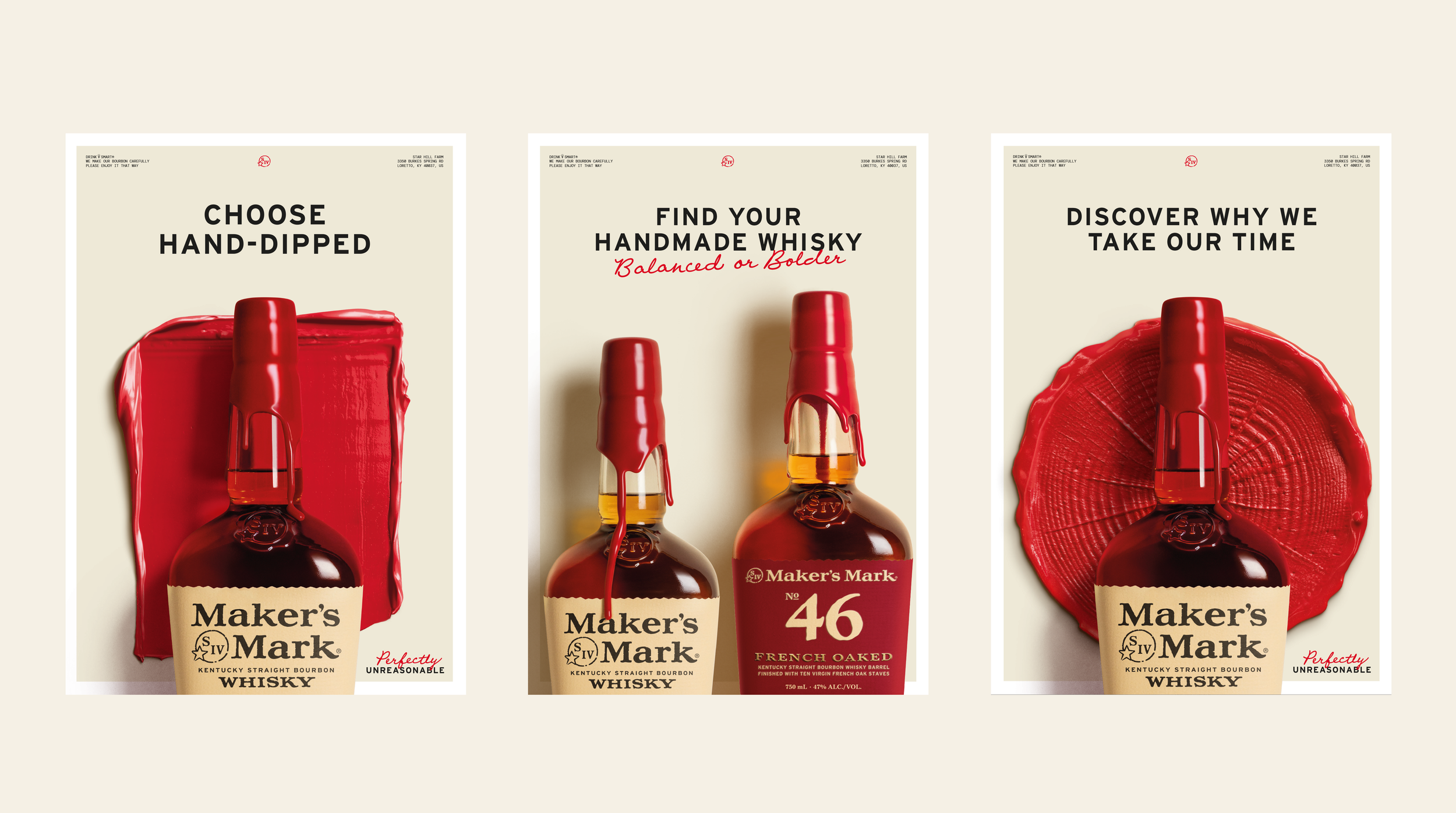
Photo Credit: Maker's MarkA Modern Expression of an Old Philosophy
The redesign is part of Maker's Mark's broader "Perfectly Unreasonable" campaign, which celebrates the unconventional decisions behind its bourbon.
That philosophy goes back to founders Bill and Margie Samuels Sr., who abandoned a 170-year-old family whiskey recipe in pursuit of something different. Their approach led to the use of soft red winter wheat instead of rye and the now-famous hand-dipped red wax seal. The new identity builds on those traditions rather than replacing them.
Maker's Mark launched its redesigned website on November 17, with elements of the identity already appearing in experiences across the United States and China, along with outdoor advertising in Australia and the United Kingdom. The global rollout will continue throughout 2027.
The AB Take
We love seeing thoughtful design in the whiskey industry, especially when it does more than make a bottle look expensive.
Maker's Mark already has one of the strongest visual identities in bourbon. The red wax is instantly recognizable, and most brands spend decades trying to achieve that.
What's interesting about this refresh is that Maker's Mark isn't trying to reinvent itself. It's finding more ways to use something it already owns.
Turning real wheat, oak and plants into physical wax impressions connects the brand's visual identity to the actual materials behind its whiskey. It's a more meaningful approach than simply introducing another polished logo or trendy typeface.
And it reinforces something Maker's Mark has understood for a long time: great branding isn't always about creating something new. Sometimes it's about recognizing what makes you different and finding a better way to tell that story.
MORE BOURBON NEWS
Shop the Artfully Bourbon Mercantile
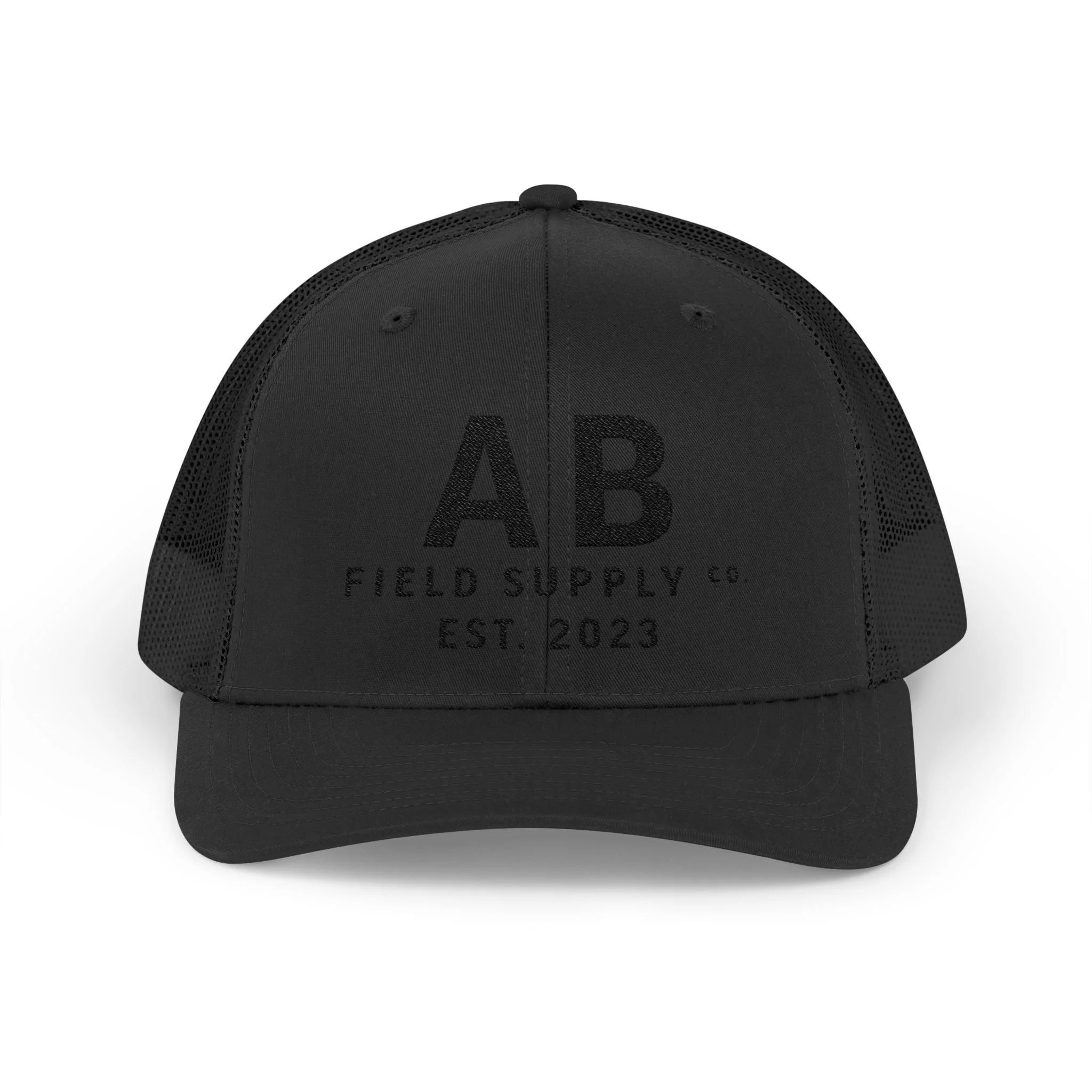
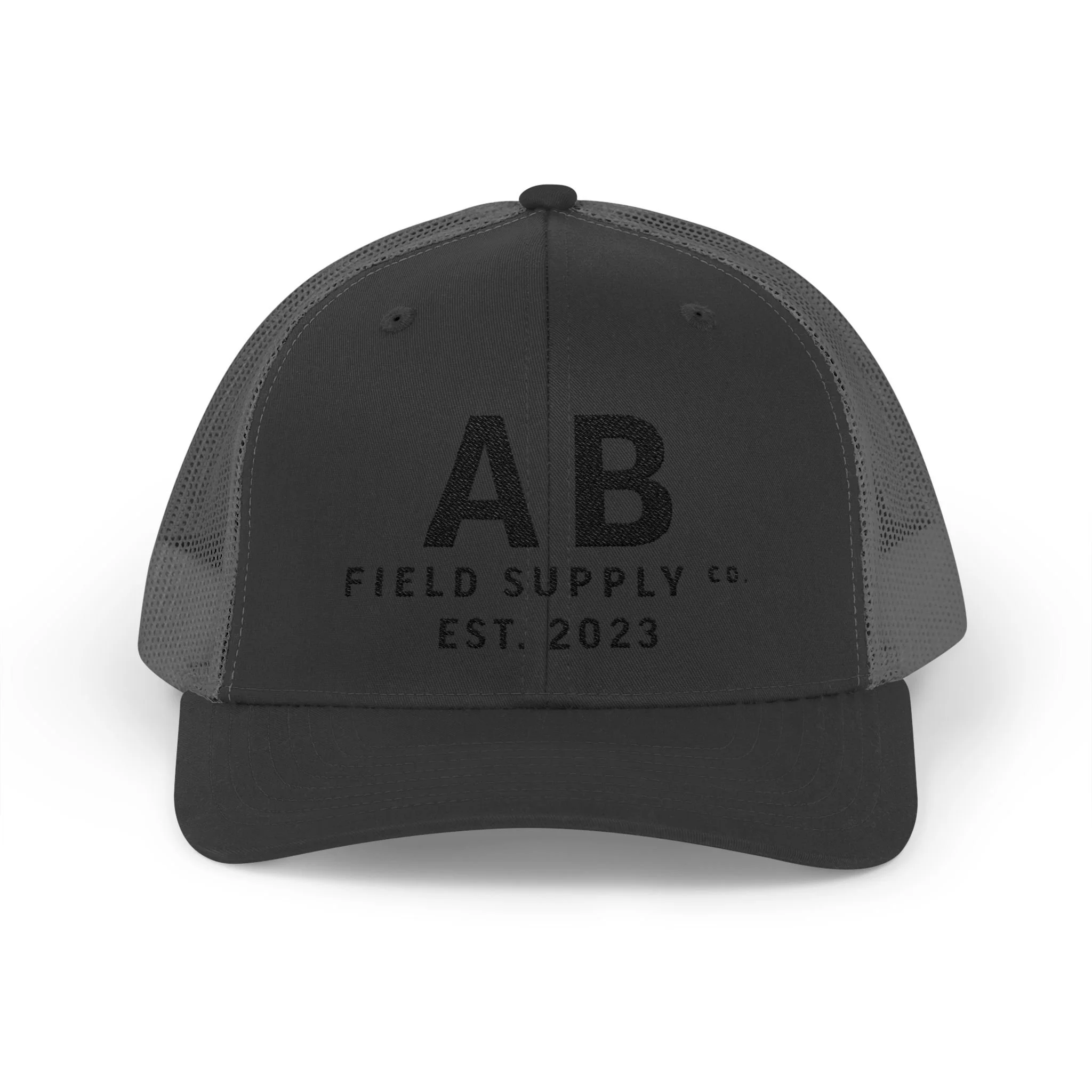
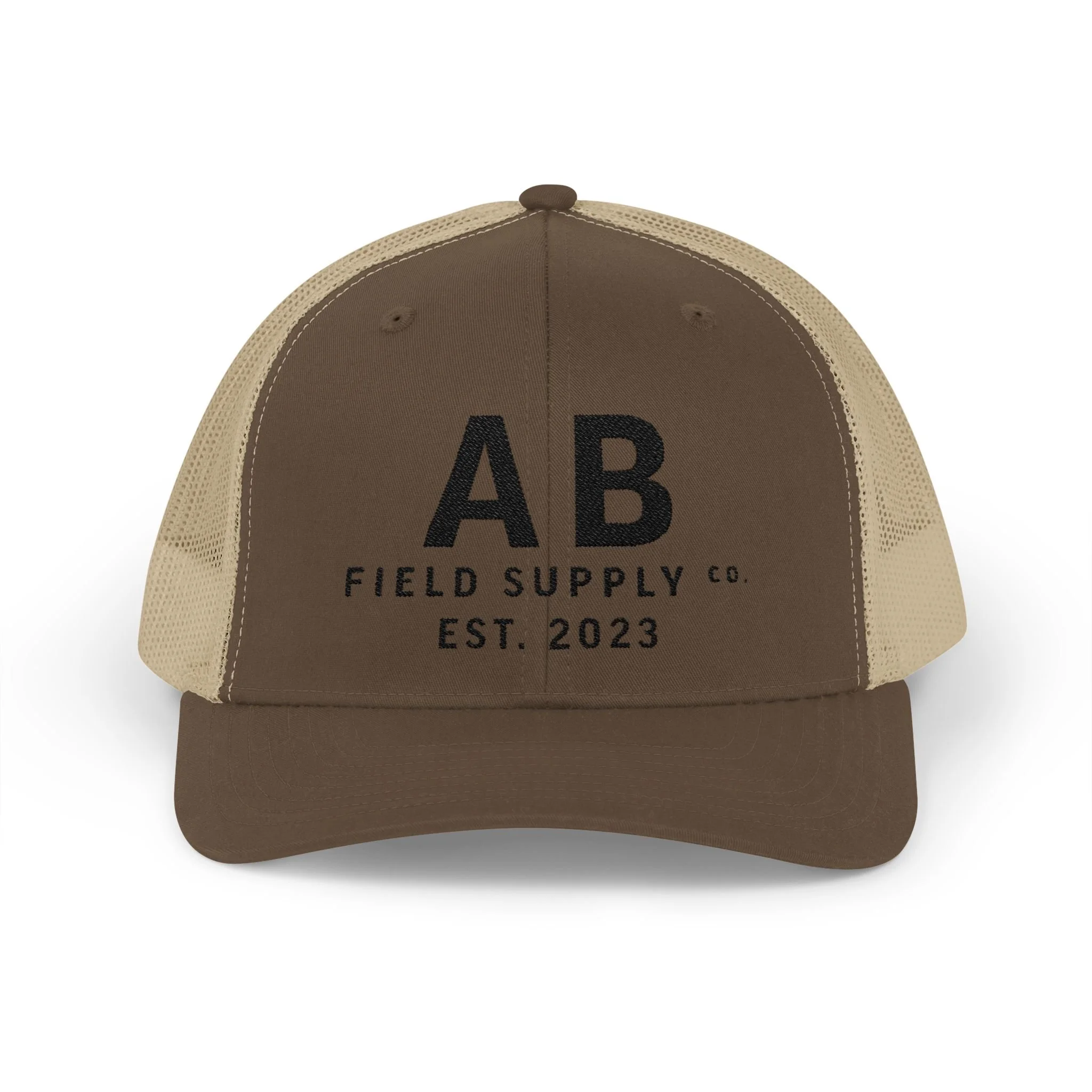
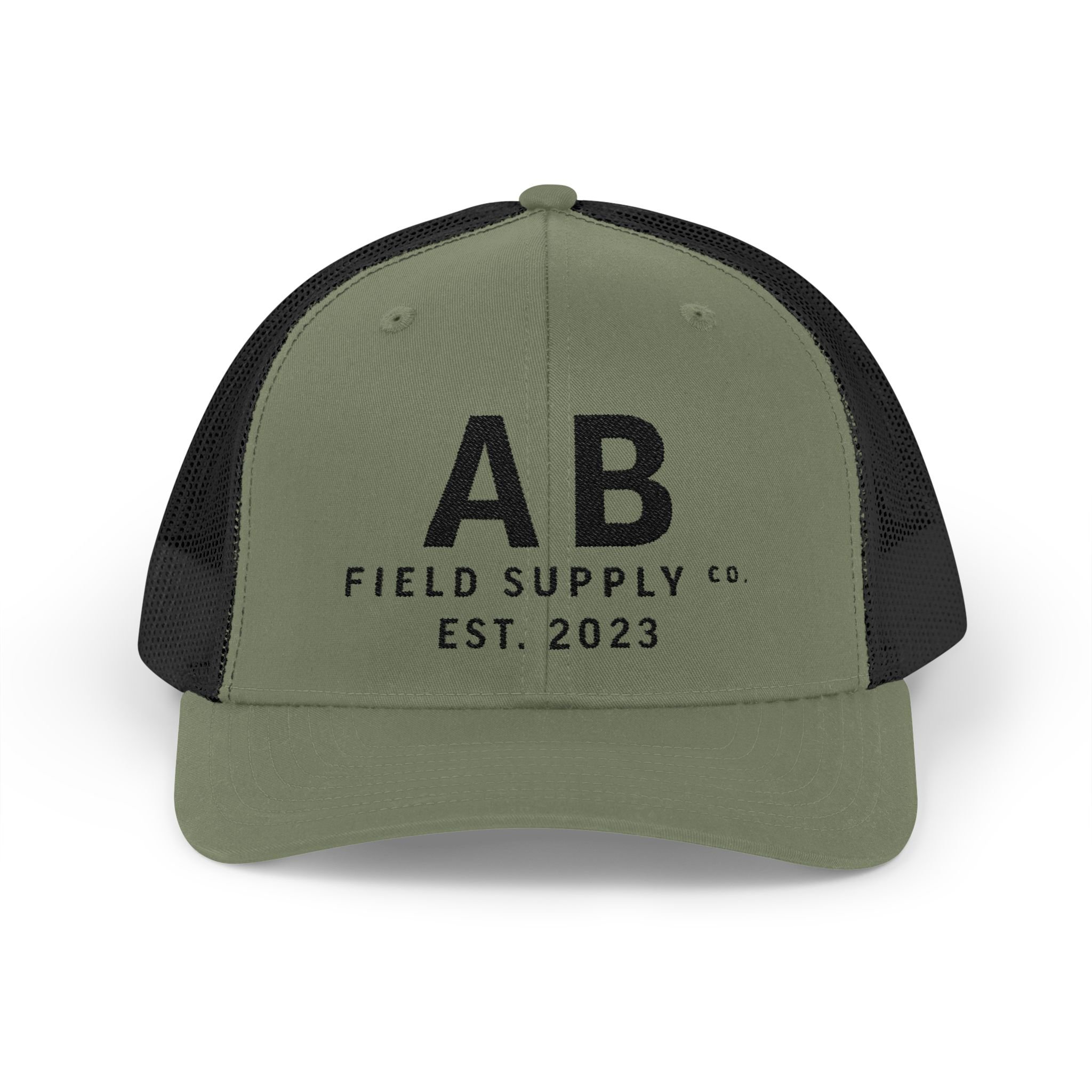
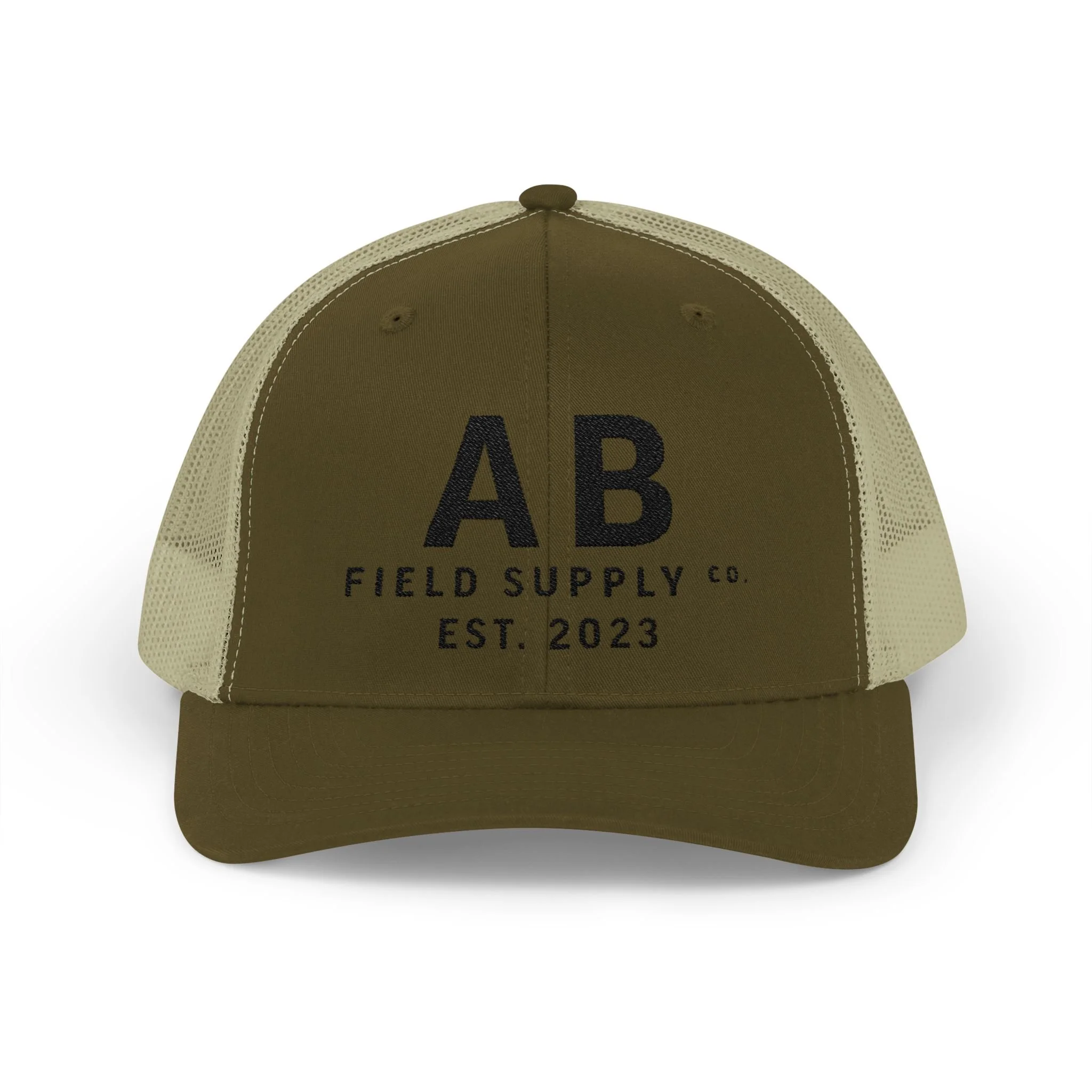
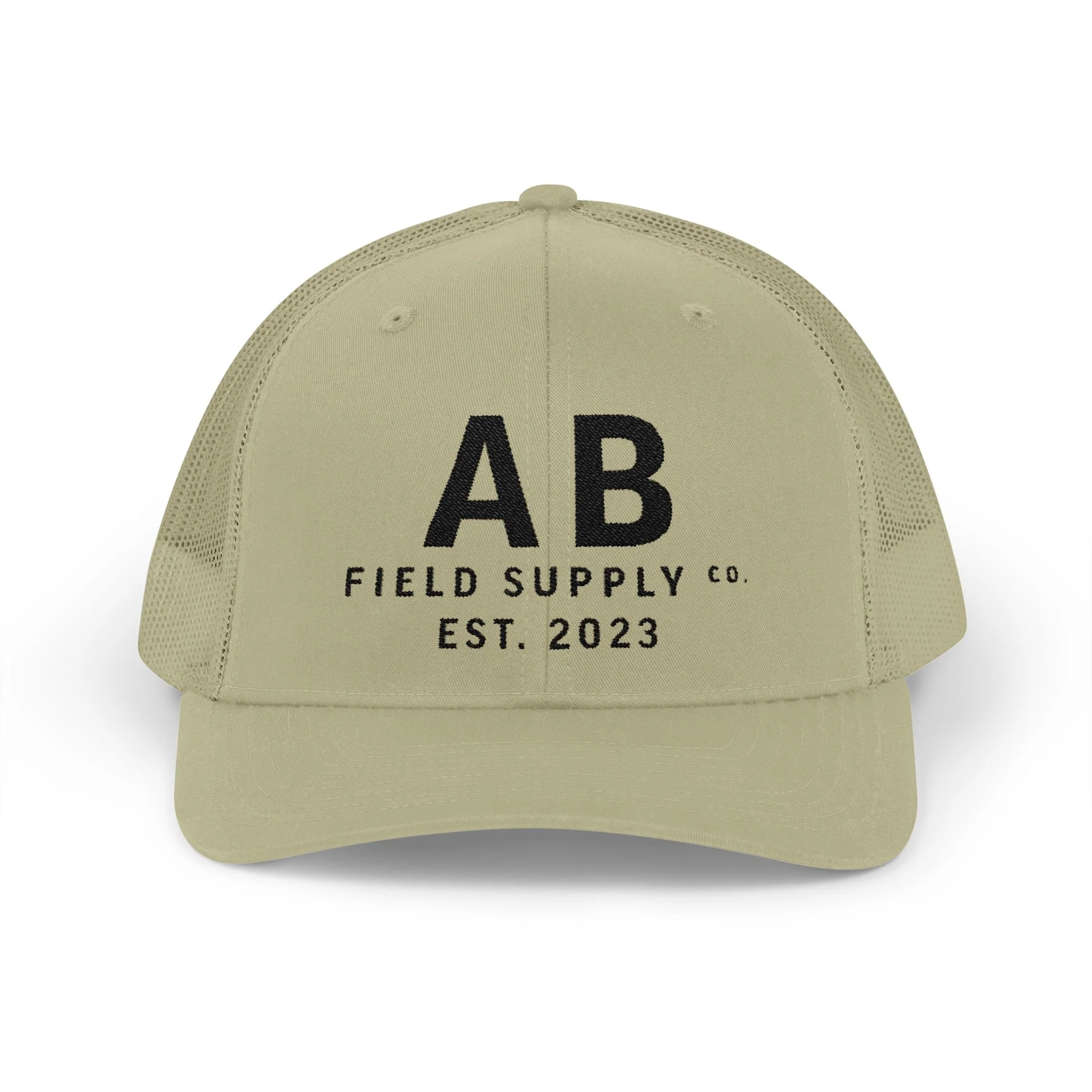
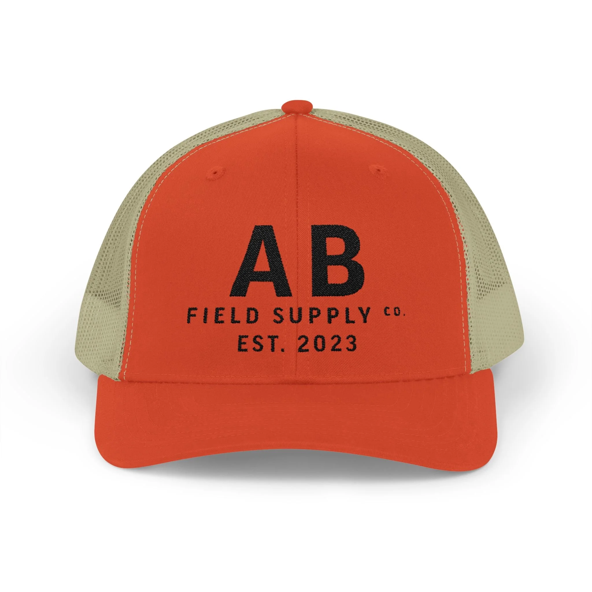
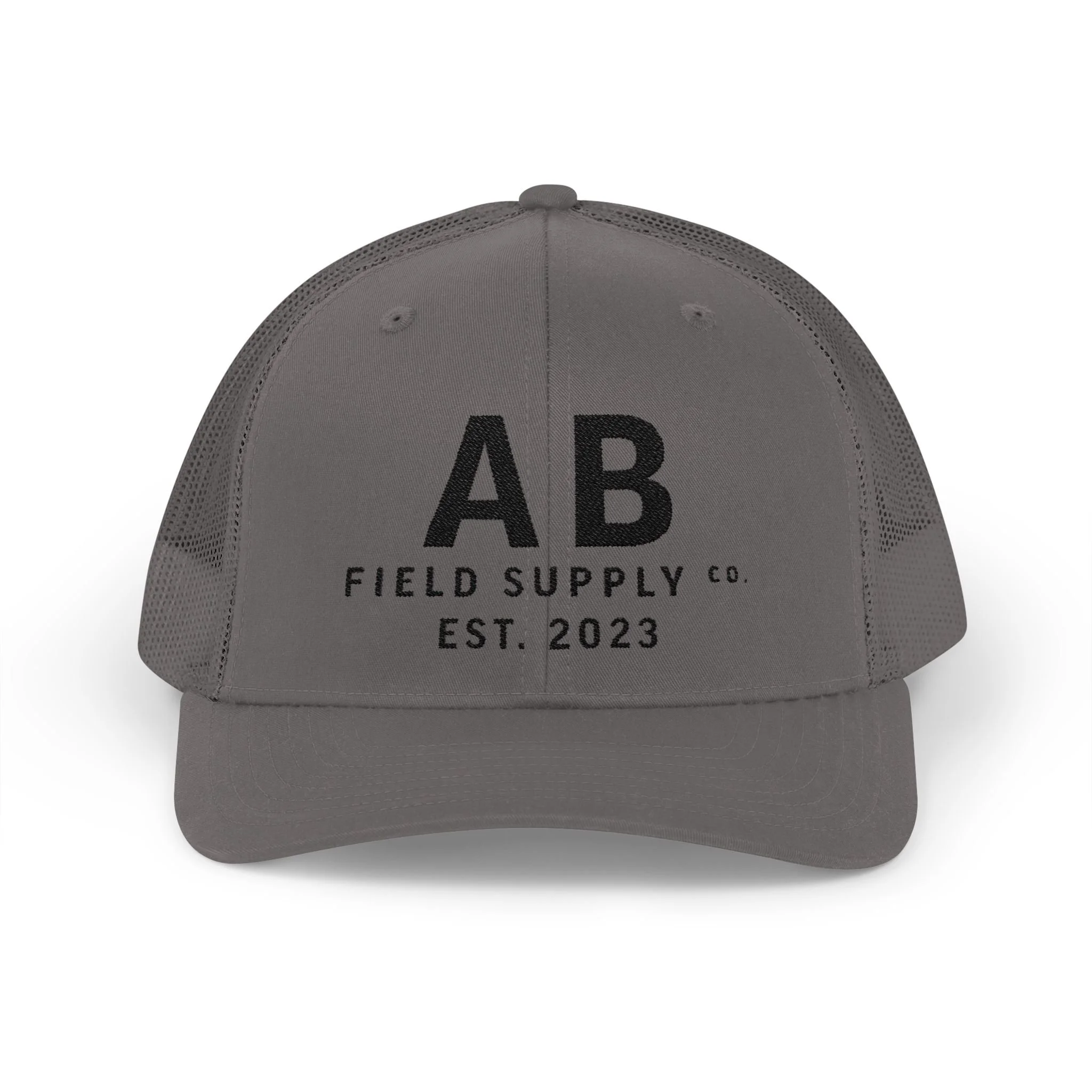
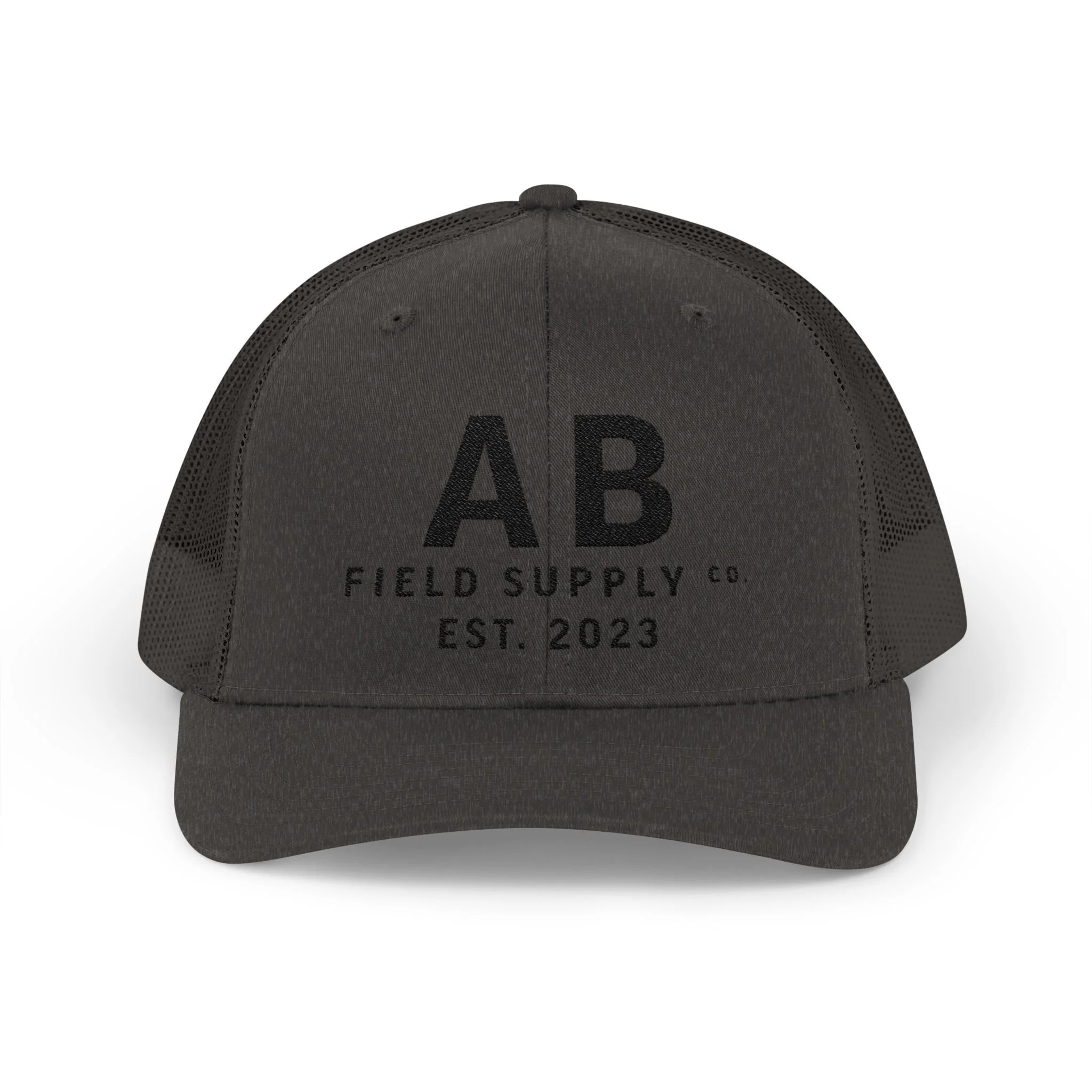
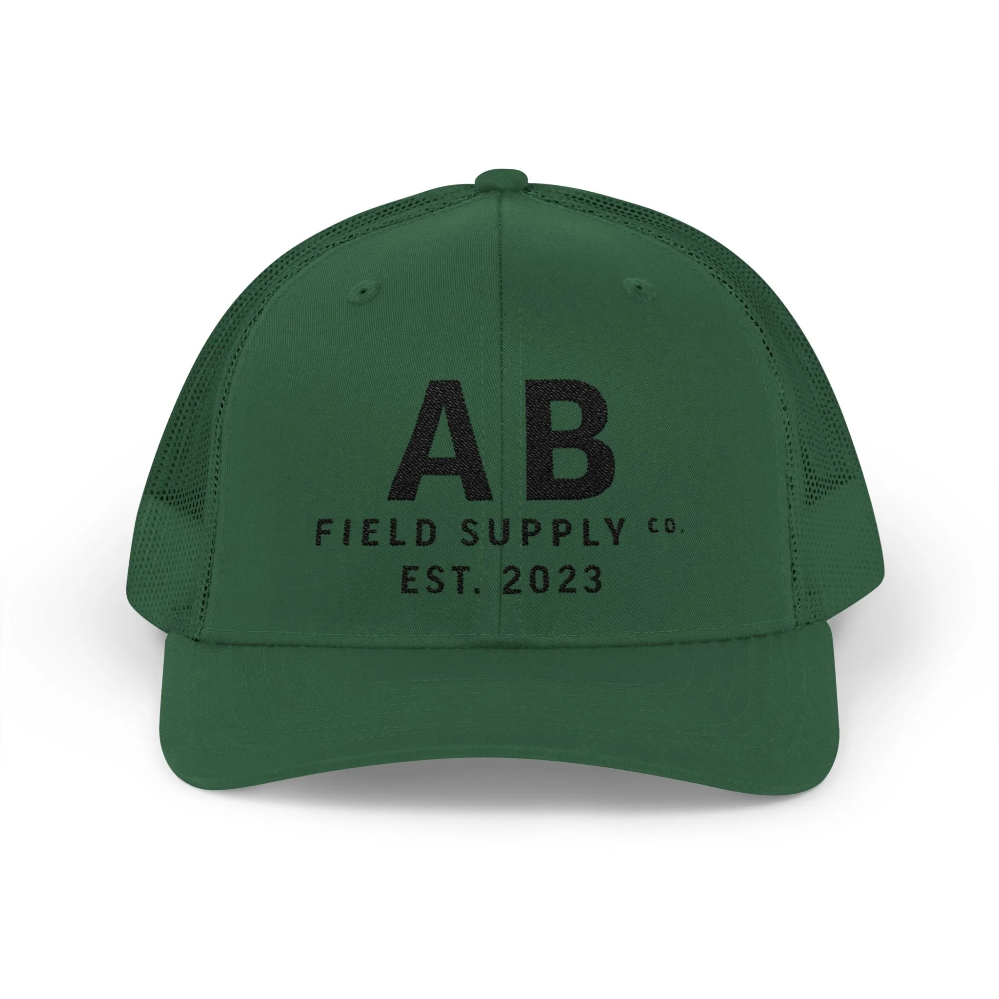
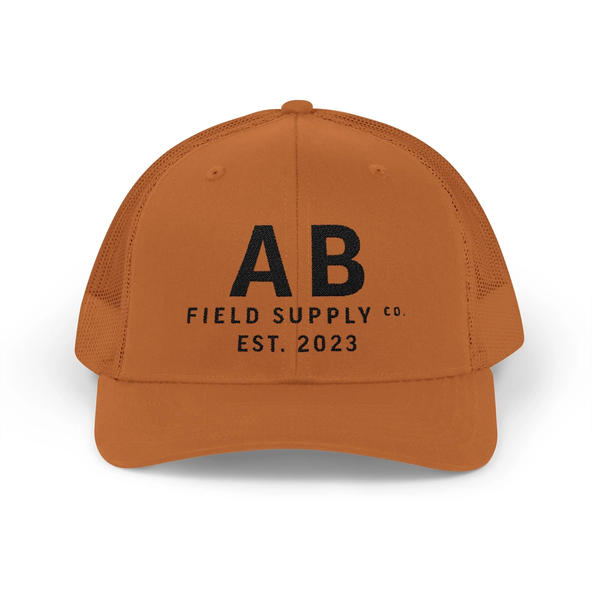
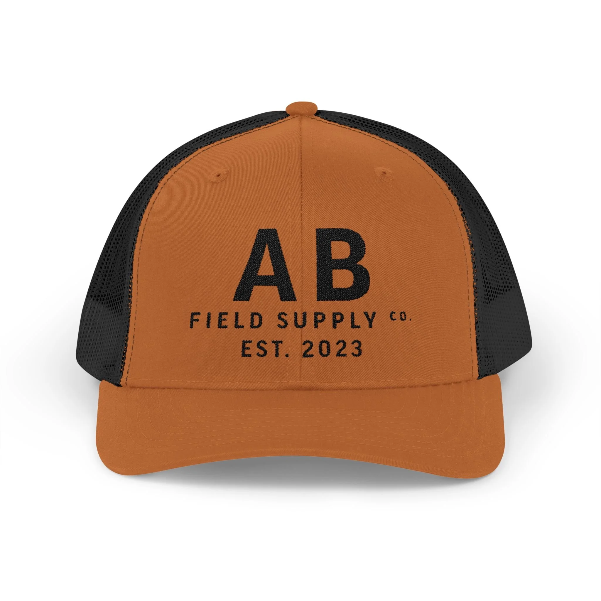
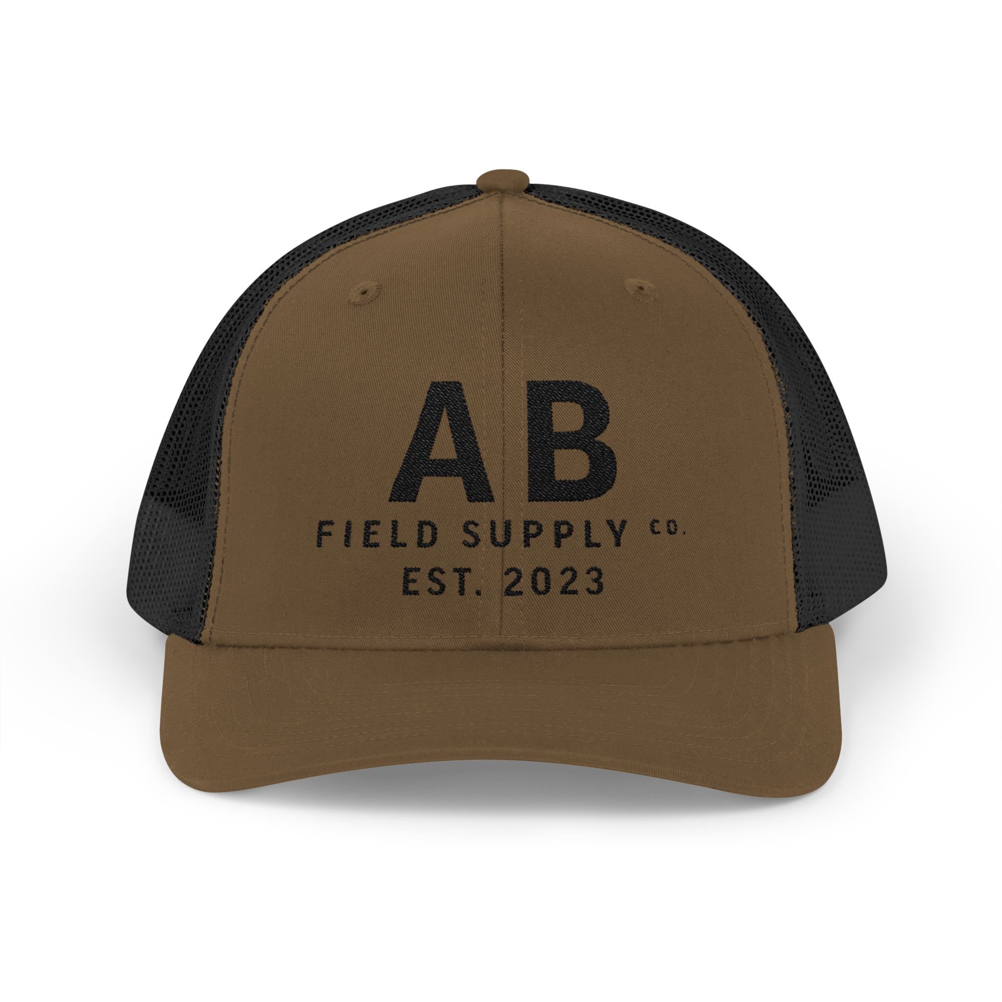
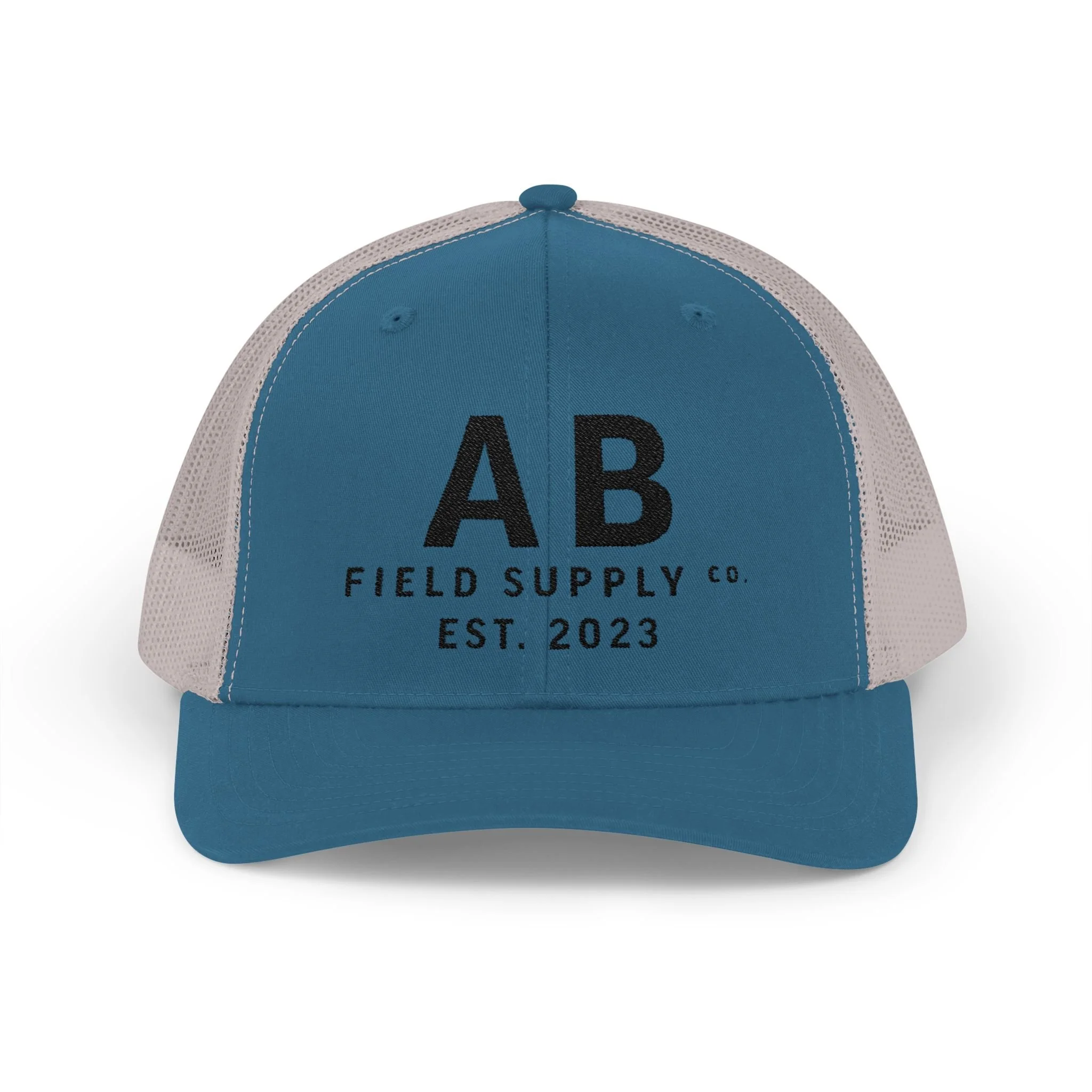
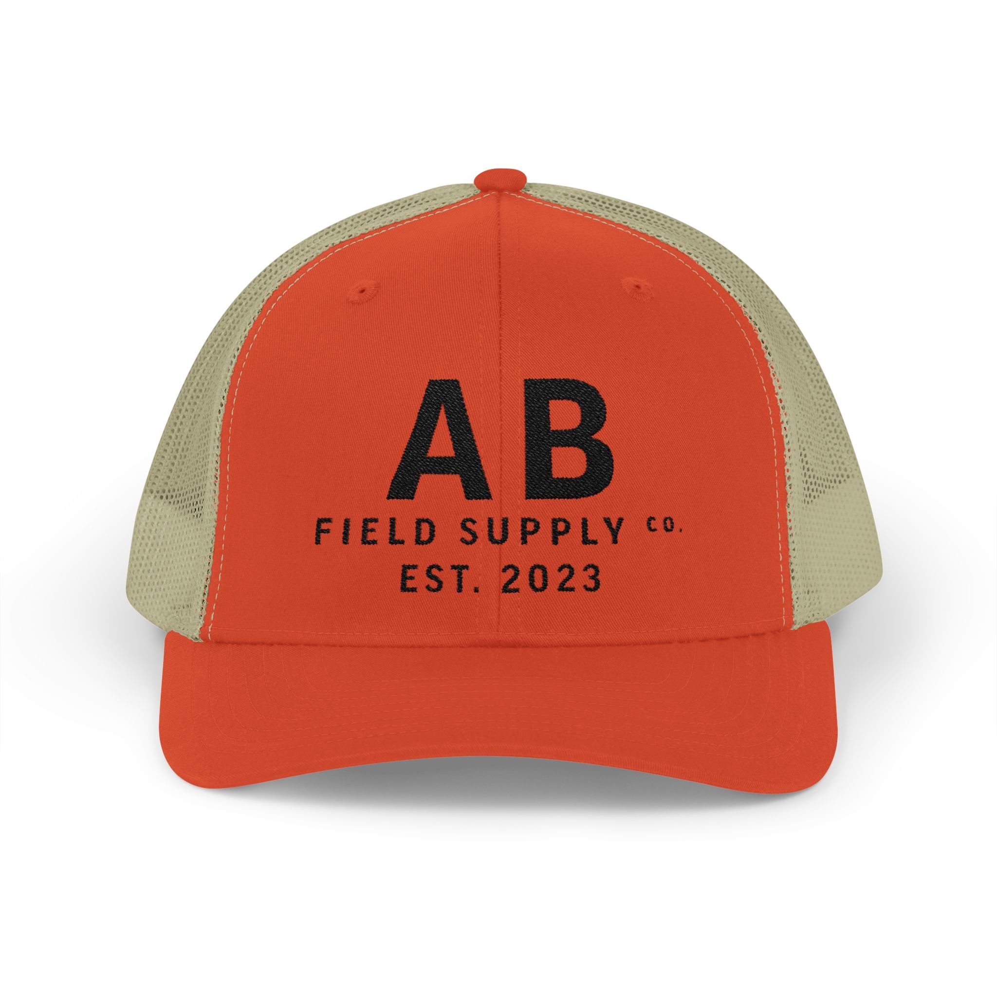
Made for long days outside and whatever comes after.
The AB Field Supply Trucker Hat pairs a structured front with a breathable mesh back and an easy mid-profile fit. The embroidered Field Supply mark keeps it clean and understated, while the curved visor and adjustable snap make it an everyday grab-and-go cap.
Made to wear in, not wear out.
Details
- Structured six-panel design
- Mid-profile fit
- Pre-curved visor
- Breathable mesh back
- Adjustable snap closure
- Cotton sweatband
- 60% cotton / 40% polyester front
- 100% polyester mesh back
Care
Spot clean with warm water and mild soap. Use a soft-bristled brush for tougher spots.
GEAR GUIDE
Looking for the glasses, tools, books, studio gear, and other things we use? We’ve collected our favorites in one place.
As an Amazon Associate, Artfully Bourbon earns from qualifying purchases.